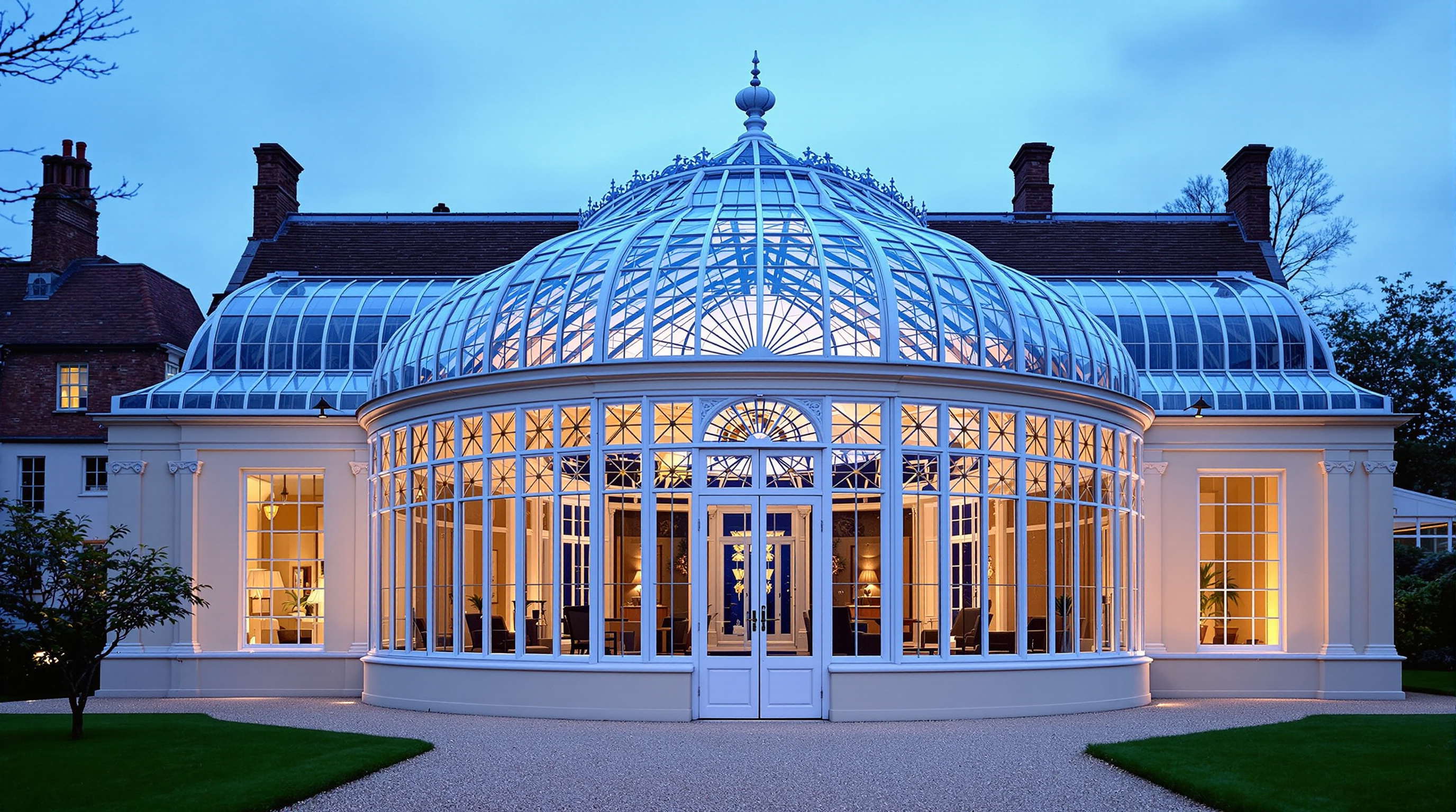
The same cream and white Victorian glass conservatory from step 2, seen from the gravel garden path at blue hour: the glazed sunburst gable with white double doors, cream pilasters and tall narrow windows, the closely ribbed barrel vault glowing amber like a lantern, two small fan palms inside the doors, and autumn trees with a brick house behind. Every fixed design detail is restated so the building stays identical.
Photoreal architectural exterior photograph of the same Victorian glass conservatory from step 2, now seen from outside at blue hour, standing on a pale gravel garden path about 15 m in front of its glazed gable end, at eye level (1.6 m), looking straight at the gable and along the length of the building, 35mm lens, 16:9 landscape composition, symmetrical, the whole building in frame slightly below center. Keep every fixed design detail identical to step 2: a long, narrow rectangular hall with a tall curved barrel-vault glass roof; many closely spaced slender white-painted iron ribs run over the vault, and the glass between them is divided by a dense grid of thin white glazing bars. The side walls are cream painted classical masonry: tall cream pilasters with carved white scroll corbels under a cream cornice, and between them very tall, narrow white-framed windows divided into long vertical panes, set above a low cream plinth wall. The gable end facing the camera is a glazed semicircle following the vault curve, filled with radiating sunburst glazing bars above a horizontal transom; below it a wide white-framed glass wall of rectangular panes with tall white double glass doors in the center, closed, each door with a small brass handle. Seen through the glass, glowing from inside: the warm beige stone tile floor, the long empty central hall, the pilasters and windows of the far end, and two small fan palms in round white planters standing just inside the doors, one on each side. The interior is lit by warm amber light from wall lamps behind the pilasters, so the whole glass vault glows like a lantern and the white ribs stand out in silhouette. Outside: the gravel path runs straight from the camera to the doors between low clipped box hedges and a mown lawn; mature deciduous trees in early autumn color stand on both sides, and a dark red brick house with lit windows is partly visible behind the trees on the left. Deep cobalt blue sky with the last pale glow low on the horizon, a few early stars, cool blue dusk mixed with warm amber interior light, faint mist over the lawn, soft reflections on the glass. Calm, romantic, timeless mood, crisp architectural detail, true colors, straight verticals. No people, no readable text, no signs or plaques, no modern objects or garden lights, no watermark.
Describe the floating cedar teahouse you imagine on a mountain lake, its scale, roof, screens, engawa, lanterns, boats, and mood, and get an architecture concept, a palette, a numbered list of fixed design details, and two image prompts showing the same teahouse from the misty morning shore approach and from inside at lantern dusk, plus a consistency checklist. Step 1 of a three-step workflow.
Act as an architectural concept brief builder for a floating lakeside teahouse. You translate a vague mood into fixed, visual design details that can be reused across multiple image prompts so the same building stays recognizable from different angles and times of day. You are concrete about materials, dimensions, and what must not change.

About the teahouse I imagine:
- Setting: a quiet mountain lake in early autumn, forested shores, soft fog
- Scale and use: intimate, seats 6 to 8 on floor cushions, ceremonial tea for small groups
- Structure vibe: Japanese-inspired cedar, not a theme-park copy; quiet, handmade, slightly weathered
- Must include: hipped cedar shingle roof, sliding paper shoji, narrow engawa deck, two stone lanterns on the dock, a small tied wooden boat
- Must avoid: neon signs, glass curtain walls, people in the frame, readable text
- Mood words: hushed, misty, warm wood, contemplative
- Preferred views to generate later: morning approach from the shore path; dusk interior looking out across the water

Please do the following:
1. Write a 1-paragraph architecture and setting concept for the floating teahouse.
2. Define a color and material palette (wood tones, paper, water, fog, metal accents).
3. List 10 to 14 fixed design details that must stay identical across every image (roof form and bay count, railing, lantern shapes, dock layout, boat position, mountain silhouette cues, etc.).
4. Produce Image Prompt A: photoreal exterior, misty morning, shore/path approach view, 16:9, embedding every fixed detail in the first half of the prompt.
5. Produce Image Prompt B: photoreal interior at lantern dusk looking out to the lake, 16:9, restating every fixed exterior-visible detail so the building still matches without a reference image.
6. Add a short consistency checklist a human can use when comparing A and B.
7. Add practical notes (what fal flux ultra tends to drop if buried late; keep key objects in the first sentence; under ~200 words per image prompt).

Rules:
- No people, no readable text, no logos.
- Prefer specific measurable details over adjectives alone.
- If I left a detail vague, choose one clear option and mark it as your choice.
- Output in clear Markdown sections.
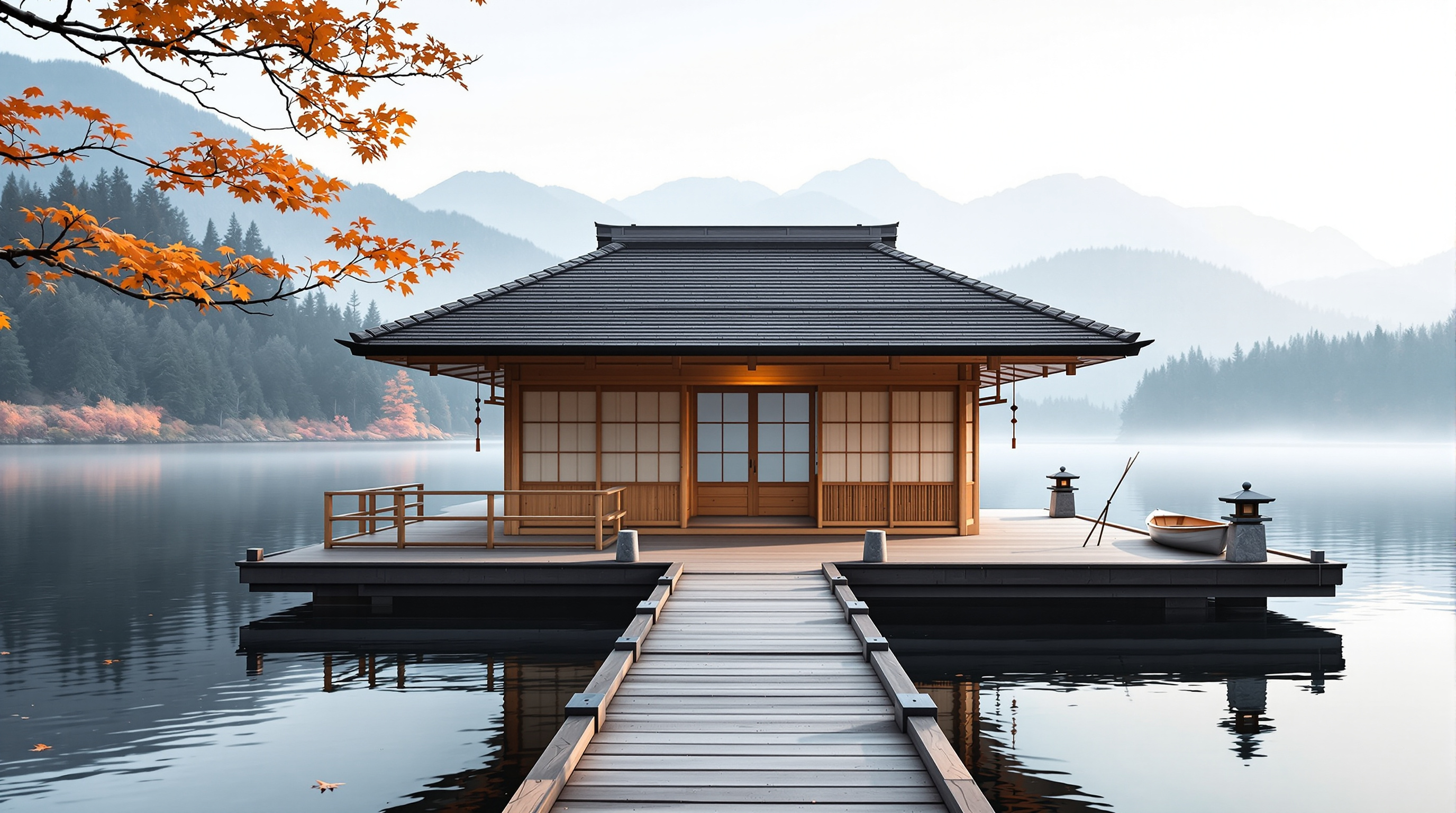
Photoreal view of a small floating cedar teahouse with a hipped shingle roof and shoji screens, approached from a shore path on a misty autumn morning, stone lanterns on the dock, a tied wooden boat, soft fog over still water, warm wood against cool blue-gray lake and mountains.
Photoreal architectural photograph of a small floating cedar teahouse on a still mountain lake in early autumn mist, 16:9 landscape, viewed from a wooden shore path approaching the dock. Key subjects first: a square one-room cedar teahouse with a dark weathered hipped shingle roof, four sliding shoji paper screens on the lake-facing side, a narrow engawa deck with simple vertical railings, two squat granite stone lanterns flanking the dock entrance, and a small tied wooden rowboat at the right side of the floating platform. The platform sits on dark timber pontoons just above the water; pale cedar walls show soft grain; copper rain chains hang at two corners. Behind the teahouse, layered blue-gray mountains fade into fog; pine forest lines the far shore; the water mirrors the roof as a soft blur. Light: low morning sun from the left, cool mist, warm wood highlights, quiet contemplative mood, crisp architectural detail, true colors. No people, no smoke plumes, no neon, no readable text, no watermark.
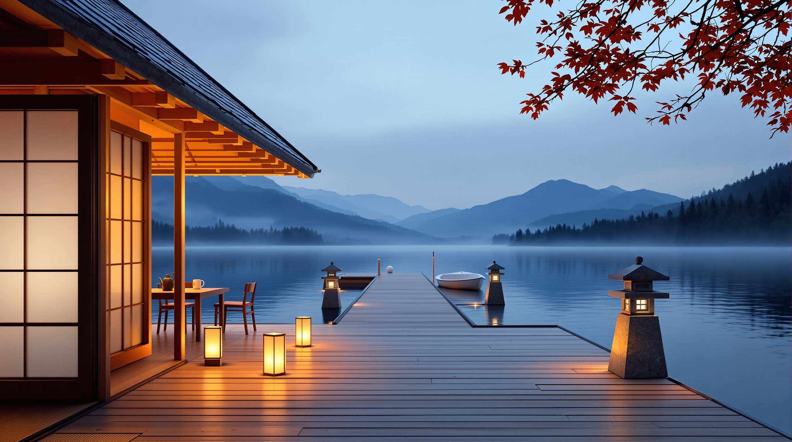
Photoreal dusk view from the deck of the same floating cedar teahouse: glowing shoji and dark tiled eaves on the left, paper and stone lanterns along the boards, a white rowboat, a long boardwalk over still blue-hour water, misty mountains and a red maple branch, restating the fixed design details of the morning view.
Photoreal photograph from the wide plank deck of a small floating cedar teahouse at lantern dusk, 16:9 landscape, camera at standing eye level beside the teahouse wall, looking out along the deck toward the lake. Key subjects first: the teahouse on the left edge with deep dark gray tiled eaves, warm honey-cedar posts and glowing pale shoji panels lit from inside, a low wooden table with two chairs on the deck, small paper lanterns glowing along the deck boards, two squat granite stone lanterns lit softly near the end of the deck, and a small white wooden rowboat resting on the far deck. Beyond, a long straight plank boardwalk runs out across still lake water at blue hour, reflecting the lantern glow, with layered blue-gray mountains in dusk silhouette, dark pine forest on the far shore, thin mist over the water, and a branch of red-orange autumn maple leaves at the upper edge. Same fixed design as the morning view: dark tiled hipped roof, cedar frame, shoji bays, stone lanterns, white rowboat, maple branch. Soft dusk light mixed with warm lantern glow, quiet contemplative mood, crisp wood grain, true colors. No people, no readable text, no neon, no watermark.
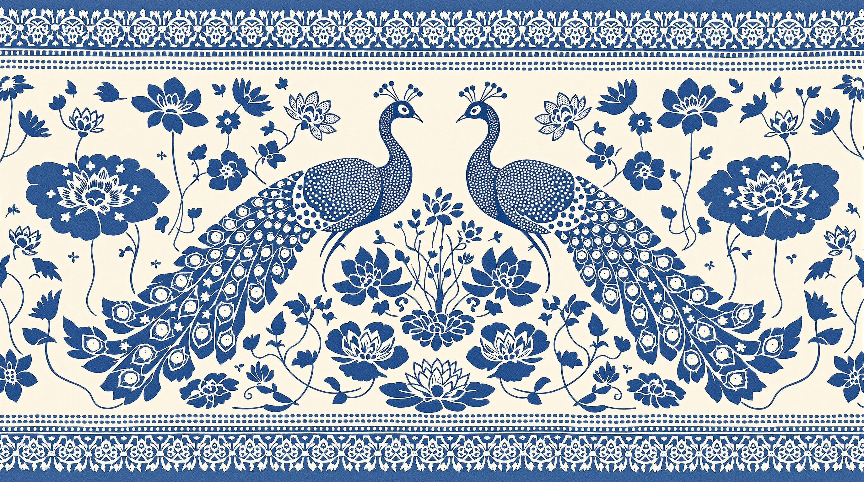
Indonesian batik textile pattern of mirrored twin peacocks beside lotus ponds in indigo and cream, with isen fills, kawung border, wax-resist crackle, and cloth weave texture. Flat ornamental fabric layout.
Twin peacocks facing each other beside lotus ponds, rendered as a traditional Indonesian batik textile pattern in indigo and cream. The peacocks fill the center with mirrored S-curved necks, fan tails filled with dotted isen motifs, and small floral medallions along the wings. Around them, oval lotus ponds hold blooming lotus flowers, pads, and tiny fish drawn as repeating geometric fills. A classic batik border frames the cloth: interlocking kawung and ceplok shapes with fine crackle lines from wax-resist dyeing. Palette limited to deep indigo blue, soft cream ground, and a few pale grey-blue washes. Hand-drawn irregularity in the lines, visible wax crackle texture, cloth weave grain, flat ornamental layout suitable for fabric. No people, no modern objects, no text, no signature.
Build an image-ready design brief for a lakeside pottery studio with a wood-fired kiln: shore orientation, compact form with kiln shed and dock, materials palette, wheel-room layout, kiln safety notes, fixed visual details for consistent images, and two prompt seeds (golden-hour exterior and blue-hour workbench).
Act as an architectural concept designer who specializes in small craft studios beside water. Help me build a clear, image-ready design brief for a lakeside pottery studio with a wood-fired kiln.

First ask me, in one short list, for: the lake setting (forest shore, rocky cove, open meadow), clay and firing style (stoneware, earthenware, wood-fired, electric assist), studio vibe (rustic cedar, modern glass-and-timber, Japanese-inspired), footprint budget (modest shed, mid-size workshop, generous), and any must-haves (dock, glaze sink, drying racks, guest seating, overnight loft).

Then produce the brief with these sections:

1. **Concept in One Sentence**: the feeling and purpose of the studio.
2. **Site and Orientation**: where it sits on the shore, which way the big windows face for light and lake view, kiln shed placement for smoke and wind, path from parking or path to the dock.
3. **Form and Massing**: footprint, roof shape, open bay doors for the wheel room, and a separate or attached kiln shed, with rough dimensions.
4. **Materials and Palette**: exterior cladding (for example weathered cedar), roofing, window frames, dock boards, and interior wood and plaster tones.
5. **Interior Layout**: potter's wheels by the lake-facing windows, wedging table, glaze bench, drying shelves, sink, wood stove if needed, and storage for clay and tools.
6. **Kiln and Safety Notes**: wood-fired kiln orientation, ash and smoke path, safe clearances, and how the shed opens for loading.
7. **Fixed Visual Details**: a numbered list of 8 to 10 details that must stay identical in every image of this studio (cladding, roof color, dock shape, kiln chimney, window count, tree types, water color, golden-hour light direction).
8. **Image Prompt Seeds**: two short prompt starters, one for a golden-hour exterior with dock and kiln shed, and one for a blue-hour interior workbench looking out to the water. Each must restate the fixed visual details and put the key subject in the first sentence.

Keep it concise, practical, and buildable. Avoid naming real architects or brands. Flag anything unsafe for wood firing near trees or a dock.
Audits foreground/background color pairs for WCAG 2.x contrast (AA and AAA for normal and large text), reports ratios and pass/fail, and notes color-blindness risks. Use when checking UI palettes, design tokens, or asking "is this gray-on-white readable?". Includes a stdlib Python contrast checker with --self-test.
---
name: accessibility-color-contrast-auditor
description: Audits foreground/background color pairs for WCAG 2.x contrast (AA and AAA for normal and large text), reports ratios and pass/fail, and notes color-blindness risks. Use when checking UI palettes, design tokens, or asking "is this gray-on-white readable?". Includes a stdlib Python contrast checker with --self-test.
---

# Accessibility Color Contrast Auditor

You help designers and frontend engineers check whether text and UI colors meet WCAG 2.x contrast ratios. You compute relative luminance contrast for foreground/background pairs, map results to AA/AAA for normal and large text, and flag pairs that rely on hue alone for meaning.

## Files in this skill

- `scripts/contrast_check.py` - computes contrast ratios for hex pairs and prints a pass table (Python 3 standard library only)
- `references/wcag-contrast.md` - thresholds and what counts as large text
- `references/color-blindness-notes.md` - why hue-only status colors fail real users
- `templates/audit-table.md` - markdown table for design reviews
- `examples/palette.json` - sample token pairs

## Workflow

### 1. Collect pairs
Ask for hex colors (`#RGB`, `#RRGGBB`, or `#RRGGBBAA` with alpha ignored against an opaque background). Note which is text/icon (fg) and which is surface (bg).

### 2. Run the checker
```
python3 scripts/contrast_check.py --fg '#1a1a1a' --bg '#ffffff'
python3 scripts/contrast_check.py --palette examples/palette.json
python3 scripts/contrast_check.py --self-test
```

### 3. Interpret
- Normal text AA needs **4.5:1**; AAA needs **7:1**.
- Large text (18pt+ or 14pt+ bold) AA needs **3:1**; AAA needs **4.5:1**.
- Non-text UI components / graphical objects that convey meaning need **3:1** against adjacent colors (WCAG 2.1 SC 1.4.11).

### 4. Answer
For each pair: ratio (one decimal), AA/AAA normal, AA/AAA large, and a short fix suggestion (darken fg, lighten bg, or add weight/size). Mention color-blindness if status depends on red vs green alone.

## Rules

- Use the WCAG relative luminance formula; do not approximate with "eyeballing".
- Ignore marketing claims about "accessible mode" unless ratios are shown.
- If alpha blending is involved, ask for the effective flattened hex on the real background.
FILE:references/wcag-contrast.md
# WCAG contrast thresholds (WCAG 2.1 / 2.2)

| Content | AA | AAA |
| --- | --- | --- |
| Normal text | 4.5:1 | 7:1 |
| Large text | 3:1 | 4.5:1 |
| UI components & graphical objects (1.4.11) | 3:1 | — |

## Large text

Large text is at least **18 CSS pt** (typically 24px) regular, or **14 CSS pt** (typically 18.66px) bold.

## Relative luminance

For sRGB channel C_srgb in 0..1:

- if C_srgb <= 0.04045: C = C_srgb / 12.92
- else: C = ((C_srgb + 0.055) / 1.055) ^ 2.4

L = 0.2126 R + 0.7152 G + 0.0722 B

Contrast ratio = (L_lighter + 0.05) / (L_darker + 0.05)

## Notes

- Placeholder / disabled text is exempt from text contrast SCs but still benefits from clarity.
- Focus indicators need 3:1 against adjacent colors (2.4.11 / 2.4.13 depending on level).
FILE:references/color-blindness-notes.md
# Color blindness notes for palettes

Contrast ratio alone is not enough when meaning is carried only by hue.

## Common pitfalls

- **Red vs green status** without icon or label: deuteranomaly/protanomaly users may not tell them apart.
- **Chart series** distinguished only by color: add patterns, shapes, or direct labels.
- **Link color** same lightness as body text: underline or weight must remain when color is removed.
- **Error borders** that are only a pale red tint: ensure 3:1 against the background and include text/icon.

## Safer patterns

1. Pair color with text ("Error", "Success") or icon.
2. Use lightness differences, not only hue shifts.
3. Test a grayscale screenshot of the UI.
4. Avoid conveying required-field state with red alone.

## Deuteranopia-friendly tip

Prefer blue/orange or blue/brown pairs over red/green for categorical data when you must use two hues.
FILE:templates/audit-table.md
# Contrast audit

- **Product / screen**:
- **Date**:
- **Standard**: WCAG 2.2 AA (default) / AAA where noted

| Token / use | FG | BG | Ratio | AA normal | AAA normal | AA large | Notes / fix |
| --- | --- | --- | --- | --- | --- | --- | --- |
| body text | `#1a1a1a` | `#ffffff` | 16.1 | pass | pass | pass | |
| muted caption | `#9ca3af` | `#ffffff` | 2.5 | fail | fail | fail | Darken to ~`#6b7280` |

## Decisions

- [ ] Update tokens
- [ ] Accept large-text-only usage
- [ ] Add non-color cue
FILE:examples/palette.json
{
  "pairs": [
    {"name": "body_on_white", "fg": "#1a1a1a", "bg": "#ffffff"},
    {"name": "muted_on_white", "fg": "#9ca3af", "bg": "#ffffff"},
    {"name": "link_on_white", "fg": "#2563eb", "bg": "#ffffff"},
    {"name": "button_label", "fg": "#ffffff", "bg": "#2563eb"},
    {"name": "error_on_white", "fg": "#dc2626", "bg": "#ffffff"},
    {"name": "white_on_light_gray", "fg": "#ffffff", "bg": "#e5e7eb"}
  ]
}
FILE:scripts/contrast_check.py
#!/usr/bin/env python3
"""WCAG contrast ratio checker for hex fg/bg pairs.

Usage:
    python3 contrast_check.py --fg '#1a1a1a' --bg '#ffffff'
    python3 contrast_check.py --palette palette.json
    python3 contrast_check.py --self-test

Python 3 standard library only.
"""
from __future__ import annotations

import argparse
import json
import math
import sys
from typing import Dict, List, Tuple


def parse_hex(color: str) -> Tuple[float, float, float]:
    c = color.strip().lstrip("#")
    if len(c) == 3:
        c = "".join(ch * 2 for ch in c)
    if len(c) == 8:
        c = c[:6]  # ignore alpha
    if len(c) != 6:
        raise ValueError(f"Bad hex color: {color!r}")
    r = int(c[0:2], 16) / 255.0
    g = int(c[2:4], 16) / 255.0
    b = int(c[4:6], 16) / 255.0
    return r, g, b


def channel(c: float) -> float:
    if c <= 0.04045:
        return c / 12.92
    return ((c + 0.055) / 1.055) ** 2.4


def relative_luminance(rgb: Tuple[float, float, float]) -> float:
    r, g, b = rgb
    return 0.2126 * channel(r) + 0.7152 * channel(g) + 0.0722 * channel(b)


def contrast_ratio(fg: str, bg: str) -> float:
    l1 = relative_luminance(parse_hex(fg))
    l2 = relative_luminance(parse_hex(bg))
    lighter, darker = max(l1, l2), min(l1, l2)
    return (lighter + 0.05) / (darker + 0.05)


def evaluate(ratio: float) -> Dict[str, bool]:
    return {
        "aa_normal": ratio >= 4.5,
        "aaa_normal": ratio >= 7.0,
        "aa_large": ratio >= 3.0,
        "aaa_large": ratio >= 4.5,
        "ui_3_1": ratio >= 3.0,
    }


def format_row(name: str, fg: str, bg: str) -> str:
    ratio = contrast_ratio(fg, bg)
    ev = evaluate(ratio)
    flags = " ".join(
        f"{k}={'PASS' if v else 'FAIL'}"
        for k, v in ev.items()
        if k in ("aa_normal", "aaa_normal", "aa_large")
    )
    return f"{name}: {fg} on {bg} -> {ratio:.2f}:1  {flags}"


def self_test() -> int:
    cases = [
        ("black_white", contrast_ratio("#000000", "#ffffff"), 21.0),
        ("white_black", contrast_ratio("#ffffff", "#000000"), 21.0),
        ("body", contrast_ratio("#1a1a1a", "#ffffff") > 12.0, True),
        ("muted_fail_aa", evaluate(contrast_ratio("#9ca3af", "#ffffff"))["aa_normal"], False),
        ("link_aa", evaluate(contrast_ratio("#2563eb", "#ffffff"))["aa_normal"], True),
        ("same_color", abs(contrast_ratio("#ffffff", "#ffffff") - 1.0) < 1e-9, True),
        ("short_hex", abs(contrast_ratio("#000", "#fff") - 21.0) < 1e-9, True),
        ("parse3", parse_hex("#abc") == parse_hex("#aabbcc"), True),
        ("ui_pass", evaluate(3.0)["ui_3_1"], True),
        ("aaa_border", evaluate(7.0)["aaa_normal"], True),
        ("just_under_aa", evaluate(4.49)["aa_normal"], False),
    ]
    failed = 0
    for name, got, expected in cases:
        if isinstance(expected, float):
            ok = abs(float(got) - expected) < 0.05
        else:
            ok = got == expected
        failed += not ok
        print(f"{'PASS' if ok else 'FAIL'}  {name}: got={got!r} expected={expected!r}")
    print(f"\n{len(cases) - failed}/{len(cases)} passed")
    return 1 if failed else 0


def main(argv=None) -> int:
    p = argparse.ArgumentParser(description="Check WCAG contrast for fg/bg hex pairs.")
    p.add_argument("--fg")
    p.add_argument("--bg")
    p.add_argument("--palette", help="JSON file with {pairs:[{name,fg,bg}]}")
    p.add_argument("--json", action="store_true")
    p.add_argument("--self-test", action="store_true")
    a = p.parse_args(argv)
    if a.self_test:
        return self_test()
    rows = []
    if a.palette:
        data = json.load(open(a.palette, encoding="utf-8"))
        for pair in data.get("pairs", []):
            rows.append(pair)
    elif a.fg and a.bg:
        rows.append({"name": "pair", "fg": a.fg, "bg": a.bg})
    else:
        p.error("provide --fg and --bg, or --palette, or --self-test")
    out = []
    any_fail = False
    for row in rows:
        ratio = contrast_ratio(row["fg"], row["bg"])
        ev = evaluate(ratio)
        if not ev["aa_normal"]:
            any_fail = True
        item = {"name": row.get("name", "pair"), "fg": row["fg"], "bg": row["bg"], "ratio": round(ratio, 2), **ev}
        out.append(item)
        if not a.json:
            print(format_row(item["name"], item["fg"], item["bg"]))
    if a.json:
        print(json.dumps(out, indent=2))
    return 1 if any_fail else 0


if __name__ == "__main__":
    sys.exit(main())